In our artistic and innovative world, visual communication plays a massive part in today’s society, expressing messages, establishing brand identities, and creating captivating content. The crossover between art and information is present in our lives more than ever, and typography stands as the cherry on top, weaving narratives and shaping perceptions. With its fusion of colors, shapes, and textual elements, graphic design is a symphony of visual storytelling, and at its heart lies the artful arrangement of typography.
The experts in web design at Web Design in Chicago gave us an extra hand in shaping today’s article. We will explore the significance of typography in graphic design, the principles that guide effective typographic choices, and the evolving trends in this dynamic field.
What is typography?
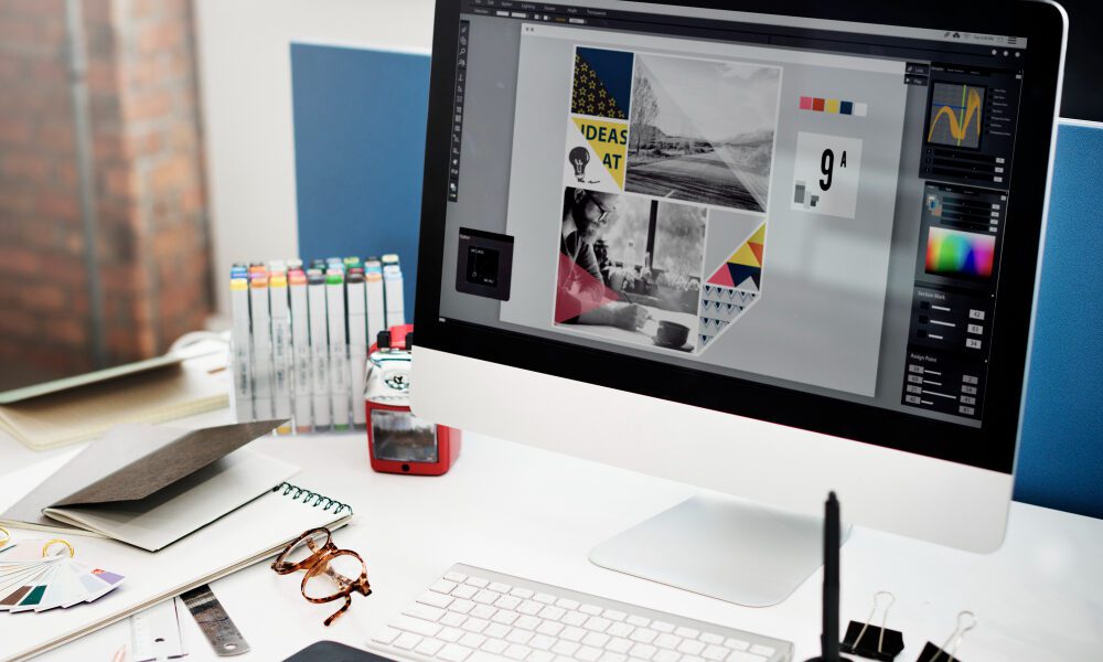
Typography, often referred to as the art of arranging type, involves selecting and arranging fonts, spacing, and other design elements to create visually engaging and readable text. We see it everywhere: in posters, blogs, informative images, logos, apps, and websites. In graphic design, typography goes beyond readability; it becomes a powerful tool for expressing the content’s tone, personality, and message and stimulates readers to take specific actions.
The importance of typography in graphic design
- Communication and legibility: Typography serves as a bridge between the message and the audience. The choice of fonts and their arrangement significantly impact the legibility of the text. A well-designed typographic hierarchy guides the reader through the content, emphasizing key points and enhancing comprehension.
- Brand identity: Typography is pivotal in establishing and reinforcing brand identities. Consistent use of specific fonts, colors, and styles across various design elements creates a cohesive and recognizable brand image. Think of Coca-Cola’s distinct script font or Apple’s branding’s clean, modern look.
- Emotional impact: Fonts carry emotional connotations. Serif fonts often convey a sense of tradition and formality, while sans-serif fonts can evoke a more modern and clean aesthetic. Designers leverage these emotional associations to align the typography with the intended mood or message of the design.
Rules of typography for graphic designers
Graphic designers use typography in a very strategic way. Sometimes to create a brand identity and sometimes to create content that engages. But all their creations have one thing in common: they have a message to convey. That is why designers use typefaces creatively and intelligently.
Hierarchy
Establishing a clear hierarchy is essential for guiding the viewer through the content and making their task more manageable. Designers should differentiate headings, subheadings, and body text in terms of size, weight, and style to emphasize the importance of each section.
Contrast
Contrast is a powerful tool in typography. Contrasting font sizes, weights, and styles create visual interest and help highlight critical information or, for example, persuade the reader to take a particular action. However, striking a balance is crucial to avoid overwhelming the viewer.
Alignment and consistency
Consistent alignment and spacing contribute to a polished and professional look. Whether it’s left-aligned, centered, or justified, maintaining consistency throughout the design enhances readability and visual appeal.
Readability
Prioritizing readability is fundamental. Factors such as font size, line spacing (leading), and line length all contribute to how easily text can be read. Legislative typography ensures that the audience can absorb the information without unnecessary strain.
Evolving trends in typography and graphic design
-
Variable fonts
Did you know that every font is designed with a psychological purpose for the reader? Variable fonts enable designers to incorporate multiple font styles (weight, width, slant, etc) into a single file. That flexibility allows for dynamic typography responsive to different screen sizes and resolutions.
-
Liquified letters
One of the latest typography styles looks abstract and almost fluid, embracing undefined shapes. The point of this style is to give a more modern, creative, and messy aesthetic look.
-
Maximalism and bold typography
Recent trends have seen a shift towards bold, maximalist typography. Designers embrace vibrant colors, large fronts, and unconventional layouts to create visually striking and memorable designs.
-
Custom typography
With the rise of branding and the need for uniqueness, custom typography has become increasingly popular. Brands and designers commission custom fonts to set them apart in a crowded visual landscape
-
Responsive typography
As digital platforms diversify, responsive typography has become crucial. Designers are creating scalable and adaptable typographic systems that ensure a consistent and engaging reading experience across various devices.
Conclusion
Typography is a cornerstone of graphic design, wielding the power to influence perception, enhance communication, and establish memorable brand identities. As the design landscape continues to evolve, staying attuned to the principles of effective typography and embracing innovative trends will be essential for designers aiming to make a lasting impact.